Creating the interface for 1upHealth's proposed price comparison tool

CMS recently implemented the Price Transparency Final Rule which requires hospitals to provide online pricing information about the services it provides. 1upHealth set out to create an app that allows patients to easily compare the relative costs of services before receiving care.
Research, strategy, user flows, wireframes, UI design, prototype
Dec 2021 - Jan 2022
Pricing availability is a step in the right direction for informed decision making in healthcare. However, there is still a significant burden on patients to find and make interpretations about the pricing information provided. How do we make the shoppable service process simpler and more meaningful for our patients?
Our price transparency app aims to aggregate nation-wide healthcare data and layer analytics to allow patients to make informed decisions with minimal effort. The end result should be high quality yet affordable healthcare.
Scroll Down to Design Process

It is important to evaluate the CMS rule that serves as the building block for our app architecture and strategy. A high level summary of the rule states:
Shoppable services should be displayed in a consumer-friendly format that allows patients to review data and make informed healthcare decisions
While there are criteria outlined for data types, CMS provides us with an ambiguous framework in terms of experience for patients during this process. We needed to unpack what "consumer-friendly" means for our patients and how we may leverage ourselves in the market.
The product team completed some basic research and product strategy before pulling design into the project. We had a productive alignment meeting with a few key takeaways:
There is opportunity for a multi-sided product in a relatively new compliance space
The strategic decision was made to target the patient interface first to test product utility
Due to time and resource constraints, our team conducted guerilla-research to gain user/product insights quickly
We were able to identify design pillars based on initial research, our understanding of the CMS rule, and an informal review of our competitors' products.
Allow for opportunities to locate and navigate to important pricing information
Implement thoughtful components that counteract information silos
Present data in a way that is clear and easily undestood by all users
Following the brief, I created initial user flows to correspond with two main use cases, comparing services and comparing providers. A variation of a sitemap was also integrated to establish the architecture of the price transparency MVP. This was particularly helpful to brainstorm types of analytics that would be most useful to include on the different screens.


Each solution highlight captures an aspect of the price transparency app and how it contributes to a simpler, more meaningful experience for our patients.
Patients want to price compare, but information is siloed and inconsistent across provider websites. The process is overwhelming and high effort.
A smart search allows input flexibility for both broad and specific searches. Some cards contain nudge badges for patients to consider during the search process. These may be good fits based on price and/or performance.


A patient wants a clear understanding of costs before undergoing a procedure with their provider. It is often difficult to locate pricing information on provider websites or the information is incomplete or difficult to understand.
A simple but specific cost breakdown allows patients to understand where and how their money will be distributed. Price analytics charts facilitate average price comparisons in different environments and markets.
A patient would like to consider a more affordable healthcare provider, but they have a large volume of information to sort through. Comparing can take a lot of time and effort.
Provider details display important analytics on quality performance and pricing by ancillary service (per CMS regulation). Insight containers provide opportunities for product navigation if there are important pricing or performance considerations.

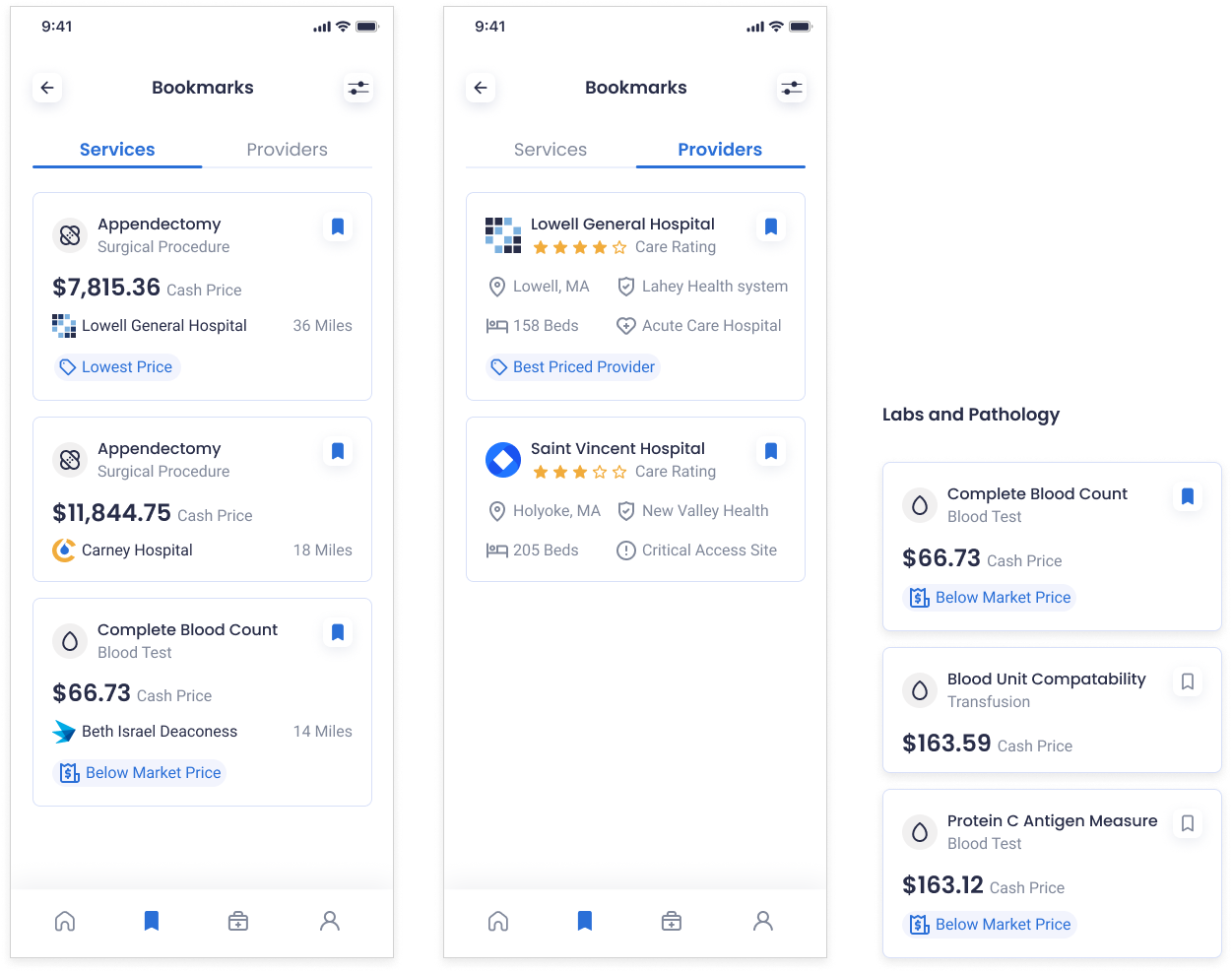
Shoppable service browsing is often done by process of elimination. Patients have difficulty keeping track of items in consideration and have no way to easily revisit items when completing price comparisons.
Bookmark buttons and smart filters are available on most product screens to allow patients the ability to customize and quickly access content that matters the most. It facilitates a more efficient price comparison process.
It would be largely beneficial to conduct usability testing and/or some preference testing to assess current design assumptions and decisions. From there, I would like to tackle a direct comparison type of tool where a patient is able to select to services or providers in a side-by-side style.